
To describe the 7 Management and Planning Tools, we can give the example for the management role to to take decision base on the data analysis and structure way to illustrate the concern.
So In 1976, the Union of Japanese Scientists and Engineers (JUSE) saw the need for tools to promote innovation, communicate information, and successfully plan major projects.
A team researched and developed these 7 new quality control tools, often called the 7 management and planning tools, or simply the 7 management tools. This will helping hands for problem solving tools.
Therefore below are the 7 management tools which we need to learn and implement in project planning phase. So lets take a look on this planning tools and techniques.

Affinity Diagrams #
The affinity diagram is a tool for organizing a large number of ideas, opinions, and facts relating to a wide problem or subject area.
In developing a vision statement, for example, senior management might conduct a brainstorming session to develop a list of ideas to incorporate into the vision. This list might include as below
- low product maintenance
- low production costs
- satisfied employees
- innovative product features
- courteous order entry
- high return on investment
- low price
- constant technology innovation
- quick delivery
- high quality
- growth in shareholder value
- motivated employees
- teamwork
- unique products
- responsive technical support
- small, lightweight designs
- personal employee growth
Once a large number of ideas have been generated, they can be grouped according to their “affinity” or relationship to each other.
An affinity diagram for the preceding list is shown in Figure 1.

Interrelationship Digraph #
An interrelationship diagraph identifies and explores causal relationships among related concepts or ideas.
It shows that every idea can be logically linked with more than one other idea at a time, and allows for “lateral thinking” rather than “linear thinking.” This technique is often used after the affinity diagram had clarified issues and problems.
Figure 2 shows an example of how the key strategic factors relate to one another. The elements having the most net outward-pointing arrows represent the primary drivers of the company’s vision: in this case, work environment and customer service.
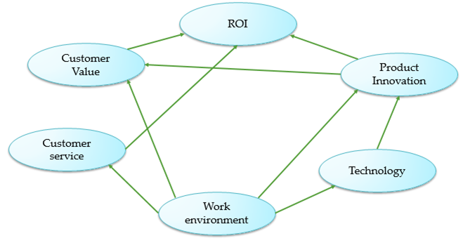
As a result, organization might develop the following vision statement:
- We will provide exceptional value to our customers. as a result of cost-effective products and services of the highest quality. leading to superior value to our shareholders.
- We will provide a supportive work environment, as a result of personal growth and the pursuit of excellence. Allows each employee to achieve his or her full potential.
- We are committed to advancing the state-of-the-art in technologies. As a result to developing market opportunities, that are built upon our unique technical expertise.
Detailed guide on interrelationship diagram published.
Tree Diagrams #
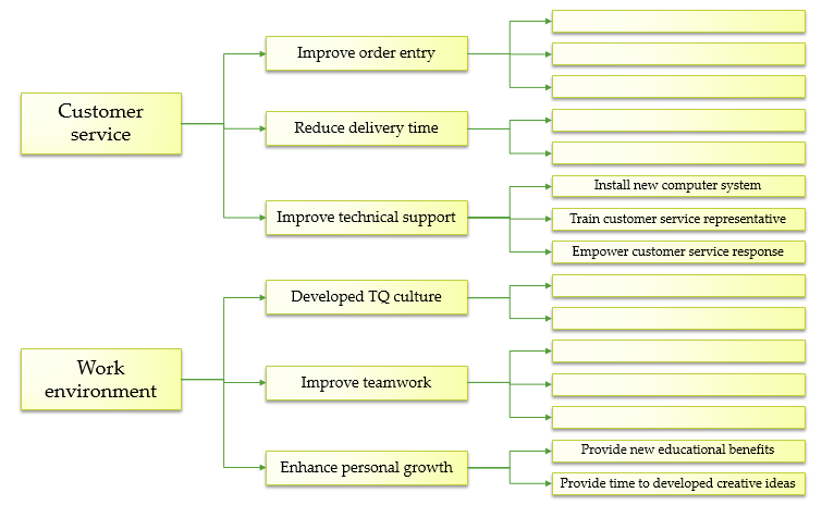
A tree diagram maps out the paths and tasks necessary to complete a specific project or reach a specified goal.
Thus, the planner uses this technique to get answers to such questions as “What sequence of tasks will address the issue?” or “What factors contribute to the existence of the key problem?”
Therefore, A tree diagram brings the issues and problems revealed by the affinity diagram and the interrelationship diagram present to the operational planning stage.
As a result a clear statement specifies problem or process. From this general statement, a team can be established to recommend steps to solve the problem or implement the plan.
For instance, the “product” produced by this group would be a tree diagram with activities and recommendations for timing the activities. Figure 3 shows an example of how a tree diagram can be used to map out key goals and strategies for organization.
Matrix Diagrams #
Matrix diagrams are “spreadsheets” that graphically display relationships between ideas, activities, or other dimensions in such a way as to provide logical connecting points between each item.
So, a matrix diagram is one of the most versatile tools in quality planning.
So matrix diagrams provide a picture of how well two sets of objects or issues are related, and can identify missing pieces in the thought process. For instance, a row without many relationships might indicate that the actions proposed will not meet the company’s goals.
Similarly, One example is shown in Figure 4: Here, we have listed the three principal goals articulated in company’s vision statement along the rows, and the key strategies along the columns.
However, symbols are used to denote strong, medium, and weak relationships.
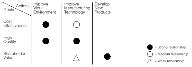
In Figure 4, we see that focused attention to these three strategies should meet organization goals. So, other matrices might relate short-term plans to medium-term objectives, or individual actions to short-term plans.
As a result, These visual prediction can help managers set priorities on plans and actions.
Matrix Data Analysis #
Matrix data analysis takes data and arranges them to display quantitative relationships among variables to make them more easily understood and analyzed.
In its original form used in Japan.
Matrix data analysis is a rigorous, statistically based “factor analysis” technique.
Many feel that this method, while worthwhile for many applications, is too quantitative to be used on a daily basis and have developed alternative tools that are easier to understand and implement.
A small example of matrix data analysis shown in Figure 5. In this example, company market researchers determined that the four most important consumer / customer requirements are price, reliability, delivery, and technical support. Through market research, an importance weighting was develop for each.
They also determined numerical ratings for the company and their best competitor. Therefore such analysis provides information as to which actions the company should deploy to better meet key customer requirements.

For example, in Figure 5, reliability is the highest in importance, and company has a narrow lead over its best competitor; thus, they should continue to strive for improving product reliability. Also, technical support is of relatively high importance, but company is consider to be down-grade to its best competitor in this category. Thus, improving the quality of support services should be a major objective.
Process Decision Program Charts #
A process decision program chart (PDPC) is a method for mapping out every possible event and contingency that can occur when moving from a problem statement to possible solutions.
Therefore a PDPC takes each branch of a tree diagram, anticipates possible problems, and provides countermeasures that will
(1) prevent the deviation from occurring, or
(2) be in place if the deviation does occur.
Figure 6: shows one example for implementing a strategy to educate and train all employees to use a new computer system.

Arrow Diagrams #
For years, construction planners used arrow diagrams to sequence and schedule project tasks.
Arrow diagram has also been teach extensively in quantitative methods, operations management, business and engineering courses in the United States.
This tools is highly recommended as planning tools in business management.
Unfortunately, its use has generally been limited to technical experts.
Therefore adding arrow diagram to the “quality toolbox” has made it more widely available to general managers and other non-technical personnel.
Figure 7 shows an example: Time estimates can easily be add to each activity in order to schedule and control the project.

As a result finally to achieve the organizational goal, we must tackle the product & process related problem and to analyse these problems we get help from 7 QC tools. Therefore these 7 QC tools gives us the analytical and statistical competence to solve the problems.


