
Introduction & Why use the 7 QC Tools? #
The 7 QC tools help to analyze the data and are most helpful in problem-solving methods. It is the fundamental tool to improve our product and process quality by identifying and analyzing the problems.

As per the Deming chain to achieve the organizational goal, we must tackle the product & process-related problems, and analyze these problems we get help from 7 QC tools. These 7 QC tools give us the analytical and statistical competence to solve the problems.
What are 7 QC tools?
7 Basic Quality techniques
- Pareto Charts
- Cause and Effect Diagrams
- Histograms
- Check sheet
- Scatter Diagrams
- Control Charts
- Flow Charts
Pareto Chart #
Purpose:
- Prioritize problems.
- Pareto Charts are used to apply the 80/20 rule of Joseph Juran which states that 80% of the problems are the result of 20% of the problems. A Pareto Chart can be used to identify 20% of route causes of problems.
How is it done?
- Create a preliminary list of problem classifications.
- Tally the occurrences in each problem classification.
- Arrange each classification in order from highest to lowest
- Construct the bar chart
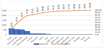
Benifits:
- Pareto analysis helps graphically display results so the significant few problems emerge from the general background
- It tells you what to work on first
Cause & Effect Analysis #
Purpose:
- Graphical representation of the trial leading to the root cause of a problem
- It’s a diagram that demonstrates the relationship between Effects and the categories of their causes
- The Arrangement of the Diagram lets it look like a fishbone it is therefore also called a fish-bone diagram
How is it done?
- Decide which quality characteristic, outcome, or effect you want to examine (may use a Pareto chart)
- Backbone – draw a straight line
- Ribs – categories
- Medium-size bones – secondary causes
- Small bones – root causes

Benifits:
- Breaks problems down into bite-size pieces to find the root cause
- Fosters teamwork
- A common understanding of the factors causing the problem
- Road map to verify picture of the process
- Follows brainstorming relationship
Go to full documentation on: Cause & Effect Analysis in Detail
Histogram #
Purpose:
- A Histogram is a bar graph
- To determine the spread or variation of a set of data points in a graphical form
- usually used to present frequency
How is it done?
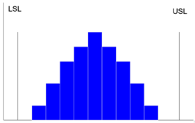
- Collect data, 50-100 data point
- Determine the range of the data
- Calculate the size of the class interval
- Divide data points into classes Determine the class boundary
- Count # of data points in each class
- Draw the histogram
Benifits:
- Allows you to understand at a glance the variation that exists in a process
- The shape of the histogram will show process behavior
- Often, it will tell you to dig deeper for otherwise unseen causes of variation.
- The shape and size of the dispersion will help identify otherwise hidden sources of variation
- Used to determine the capability of a process
- The starting point for the improvement process
Check Sheet #
Purpose:
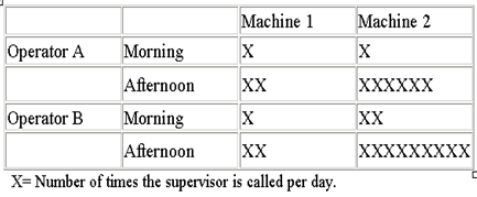
- Tool for collecting and organizing measured or counted data
- Data collected can be used as input data for other quality tools
Benifits:
- Collect data in a systematic and organized manner
- To determine the source of the problem
- To facilitate the classification of data (stratification).
Scatter Diagram #
Purpose:
- To identify the correlations that might exist between a quality characteristic and a factor that might be driving it
- A scatter diagram shows the correlation between two variables in a process.
- These variables could be Critical to Quality (CTQ) characteristics and a factor affecting it two factors affecting a CTQ or two related quality characteristics.
- Dots representing data points are scattered on the diagram.
- The extent to which the dots cluster together in a line across the diagram shows the strength.
Benifits:
- Decide which paired factors you want to examine. Both factors must be measurable on some incremental linear scale.
- Collect 30 to 100 paired data points.
- Find the highest and lowest value for both variables.
- Draw the vertical (y) and horizontal (x) axes of a graph.
- Plot the data
- Title the diagram
The shape that the cluster of dots takes will tell you something about the relationship between the two variables that you tested.
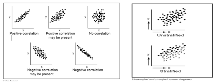
You may occasionally get scatter diagrams that look boomerang- or banana-shaped.
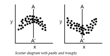
- To analyze the strength of the correlation, divide the scatter plot into two sections.
- Treat each half separately in your analysis
Benifits:
- Helps identify and test probable causes.
- By knowing which elements of your process are related and how they are related, you will know what to control or what to vary to affect a quality characteristic.
Control Chart #
Purpose:
- The primary purpose of a control chart is to predict expected product outcomes.
- Statistical tool, showing whether a process is in control or not.
- Taking samples of a process and detecting the possibility of the process being out of control
How is it done?
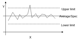
- Define Upper limit, lower limit, and medium value
- Draw Chart.
- Gather values and draw them into the chart
Benifits:
- Predict process out of control and out of specification limits
- Distinguish between specific, identifiable causes of variation
- Can be used for statistical process control
Strategy for eliminating assignable-cause variation:
- Get timely data so that you see the effect of the assignable cause soon after it occurs.
- As soon as you see something that indicates that an assignable cause of variation has happened, search for the cause.
- Change tools to compensate for the assignable cause.
Strategy for reducing common-cause variation:
- Do not attempt to explain the difference between any of the values or data points produced by a stable system in control.
- Reducing common-cause variation usually requires making fundamental changes in your process
Flow chart #
Purpose:
- Visual illustration of the sequence of operations required to complete a task.
- Schematic drawing of the process to measure or improve.
- The starting point for process improvement
- A potential weakness in the process is made visual.
- Picture the process as it should be.
- Way of representing a Procedure using simple symbols and arrows
How is it done?

- List major steps
- Write the process step inside each symbol
- Connect the Symbols with arrows showing the direction of the flow
- List sub-steps under each in the order they occur
Benifits:
- Identify process improvements
- Understand the process
- Shows duplicated effort and other non-value-added steps
- Clarify working relationships between people and organizations
- Target specific steps in the process for improvement.
- Simplest of all flowcharts
- Used for planning new processes or examining an existing one
- Keep people focused on the whole process
- Show what happens at each step in the process
- Show what happens when non-standard events occur
- Graphically display processes to identify redundancies and other wasted efforts


