
What Is a Scatter Chart? #
A Scatter Chart (also called a Scatter Diagram or Scatter Plot) is one of the 7 QC Tools used to find out relationships between two variables.
It visually shows how one factor affects another.
For example, how machine speed impacts defect rate, or how temperature influences paint thickness.
In manufacturing and automotive industries, quality engineers use Scatter Charts to determine whether there is a correlation (positive, negative, or none) between process parameters and output results.

In short: A Scatter Chart helps you see patterns in your process, it shows cause-and-effect visually before you even perform complex statistical analysis.
Concept Explanation – How Scatter Charts Work #
A Scatter Chart consists of two variables plotted on X and Y axes:
- X-axis: Independent variable (the cause or input, e.g., temperature, pressure, time).
- Y-axis: Dependent variable (the effect or output, e.g., defect count, surface finish).
Each point on the chart represents a pair of data values, one from X and one from Y.
When all points are plotted, their pattern shows the type of correlation:
| Type of Correlation | Pattern Observation | Example |
|---|---|---|
| Positive correlation | Points rise upward, as X increases, Y increases | Speed increase – Vibration increase |
| Negative correlation | Points slope downward, as X increases, Y decreases | Temperature increase – Viscosity decrease |
| No correlation | Points scattered randomly | Operator age vs. Product defect |


This visual pattern helps engineers decide if two factors are related and whether changes in one could control the other.
Step-by-Step: How to Create a Scatter Chart #
Follow these simple steps to create and interpret a Scatter Chart in your quality projects:
Step 1: Define the Purpose #
Identify what relationship you want to study , e.g., “Does increasing torque affect the failure rate?”
Step 2: Collect Paired Data #
Gather data for both variables (e.g., torque and failure rate) from the same production time frame.
| Sample No. | Torque (Nm) | Failure Rate (%) |
|---|---|---|
| 1 | 10 | 1.2 |
| 2 | 12 | 1.5 |
| 3 | 15 | 2.0 |
| 4 | 18 | 2.6 |
| 5 | 20 | 3.1 |
Step 3: Draw the Axes #
- Plot X-axis = Independent variable (Torque).
- Plot Y-axis = Dependent variable (Failure Rate).
Step 4: Plot Data Points #
Mark each pair of values on the chart.
Each point represents one observation.
Step 5: Observe the Pattern #
- If points form a rising line, positive correlation.
- If points form a declining line, negative correlation.
- If points are scattered, no correlation.
Step 6: Interpret and Take Action #
If correlation exists, study the cause-and-effect.
For example: If higher torque consistently increases failures, review the tightening process or torque specifications.
Real-World Example – Automotive Manufacturing #
Let’s say you are a Quality Engineer in an automotive seat assembly line.
You suspect that torque variation in bolt tightening affects seat movement noise (NVH issue).
You record 10 samples:
| Sample | Torque (Nm) | Noise Level (dB) |
|---|---|---|
| 1 | 7.5 | 62 |
| 2 | 8.0 | 60 |
| 3 | 8.5 | 59 |
| 4 | 9.0 | 58 |
| 5 | 9.5 | 57 |
| 6 | 10.0 | 55 |
| 7 | 10.5 | 54 |
| 8 | 11.0 | 52 |
| 9 | 11.5 | 52 |
| 10 | 12.0 | 50 |
When you plot these data on a Scatter Chart, the points slope downward, indicating a negative correlation, as torque increases, noise decreases.

Interpretation:
Maintaining proper torque levels can reduce noise issues in seat assembly.
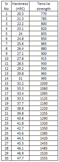
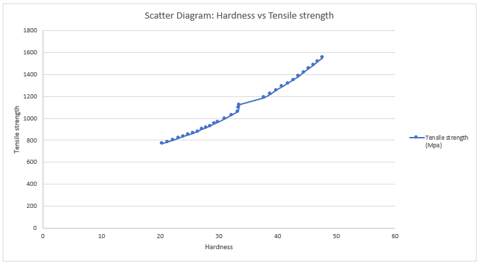
Another example:
Advantages of Using a Scatter Chart #
- Simple and visual way to analyze relationships between variables.
- Helps in early-stage problem diagnosis before deeper statistical studies.
- Useful for process optimization and root cause analysis.
- Strengthens data-driven decision-making.
Limitations of Scatter Chart #
- Shows correlation, not causation (just because two variables move together doesn’t mean one causes the other).
- Cannot handle more than two variables at once.
- Not suitable for categorical or qualitative data.
- Limited accuracy with very small datasets.
Best Practices & Tips #
- Always use paired and consistent data (taken under same conditions).
- Collect at least 10-20 data pairs for meaningful analysis.
- Use trendline or correlation coefficient (r) to quantify the relationship.
- Label axes clearly with units.
- Avoid connecting points, use dots only.
- Combine Scatter Chart findings with Cause-and-Effect Diagram or 5 Why Analysis to validate results.
Common Mistakes & How to Avoid Them #
| Mistake | How to Avoid |
|---|---|
| Mixing different time periods or data sources | Collect data under controlled and consistent conditions |
| Using categorical data (e.g., color, type) | Only use numerical continuous data |
| Interpreting correlation as causation | Confirm with experiments or additional QC tools |
| Overcrowded or missing labels | Keep charts clean and labeled for clarity |
Scatter Chart Template / Checklist #
Before creating a Scatter Chart, ensure you have:
- Defined objective clearly (what variables to compare)
- Collected at least 10 valid paired samples
- Verified units and data accuracy
- Chosen correct scales for X and Y axes
- Labeled axes and chart title properly
- Checked correlation visually and (optionally) statistically

Summary / Key Points #
- Scatter Chart is a visual QC tool to study the relationship between two variables.
- It helps identify positive, negative, or no correlation in process data.
- Widely used in automotive and manufacturing industries for problem-solving and process optimization.
- It’s a foundation step before advanced tools like Regression Analysis or DOE (Design of Experiments).
Frequently Asked Questions (FAQ) #
To find and visualize the relationship between two measurable variables, cause and effect.
At least 10–20 paired samples are ideal for meaningful interpretation.
No, it only shows correlation. Further study (e.g., experiments) is needed to confirm cause.
You can combine it with Check Sheets, Pareto Charts, and Cause-and-Effect Diagrams for complete analysis.
No, it’s only for numerical continuous variables.
Now it’s your turn!
Download the free Scatter Chart Excel template and start analyzing your own process data today.
Then continue your learning,
Read the next tool in the 7 QC Tools series: Control Chart – Step-by-Step Guide


