This is a complete guide to learning about control charts.
If you really want to learn detailed control charts in an easy way, you will enjoy and learn in this post.
The purpose of this post is to get the concept knowledge of the control chart & types of control charts. It is very helpful in statistical process control (SPC).
Let’s started in…

We are daily fighting with the process to achieve defect-free product outcomes.
so for that, we need to control the production process parameters.
In this post, we will learn the quality methods used during the control stage of the process.
The only tool to read the process is control charts. These are the major tools used to control the parameters in production.

What is mean by process control?
During manufacturing, process control is the quality effort.
Therefore the aim is to achieve the manufacturing objective proactively.
So to avoid the production of defects in the process.
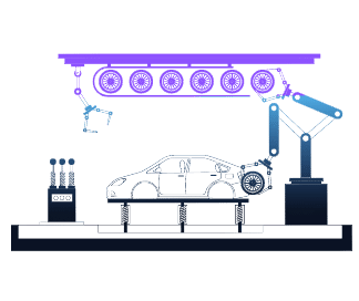
The process is run using the terms such as time, speed, pressure, and temperature. These terms we called process parameters.
These process parameters are set by using the experiments during the initial project development i.e APQP stage.
So that we get the product output within specification level.
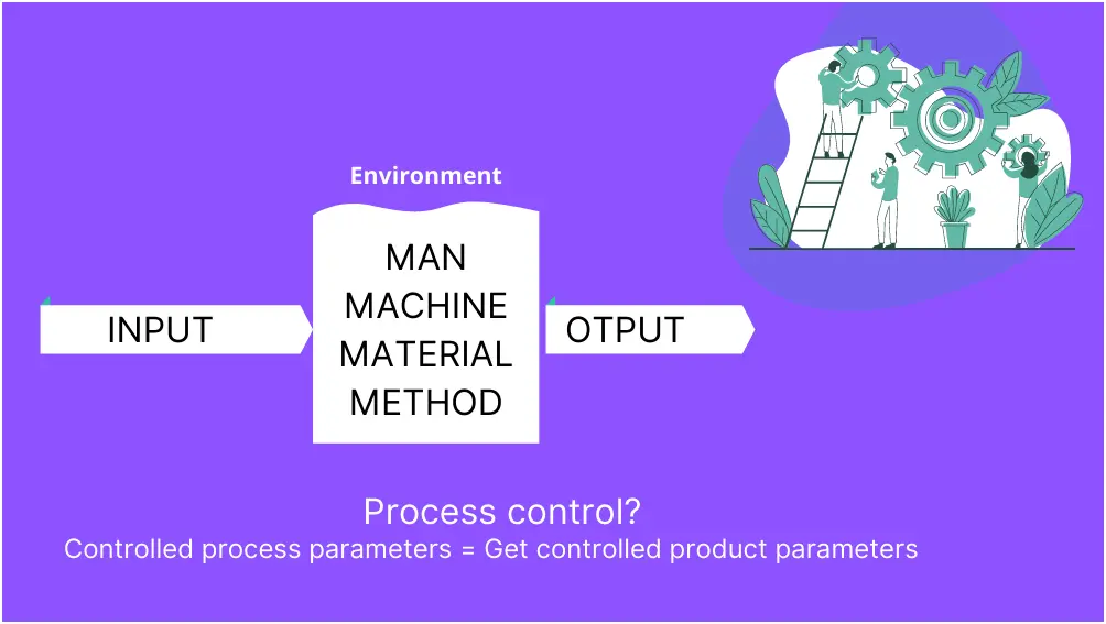
similarly, changes in process parameters will affect the product quality.
Therefore these parameters are maintained or controlled consistently, to produce the OK product.
So to monitor the product and process parameters, for controlled consistency we use the control charts.
And finally, the process of controlling the product and process parameter is process control.
Control Chart
Nowadays manufacturing industry is facing a lot due to process variation which leads to producing defects and facing huge costs.
Let’s dive into the topics which we will learn in this post…
Today I’m going to explore the concept of control charts with detail SCOPE,
You will also see what are the types of control charts in the process control approach.

What is a control chart?
Dr. Walter Shewhart invents the control charts in the 1920s.
Therefore the control charts are also called Shewhart’s charts.
The control chart procedure is proposed during the working for Bell lab.
According to Shewhart, the source of variation is present in the process in two ways.
Variation due to common cause and special cause variation.
Therefore control chart is the differentiating between two sources of variation.
You can read common cause and special cause variations explained in SPC.
Purpose of control chart
As we set there is a lot of variation in process parameters leading to producing defects.
Therefore the primary purpose of the control charts is to predict the expected product outcome.
It is a statistical analysis tool. This tool shows whether the process is in control or not.
Also, this is one of the important tools of the 7 QC tools. To learn more about the 7QC tools Click here.
So the primary purpose of control charts is to take samples from the process and detect the possibility of the process being in control or out of control.
How does it work?
First, we need to define limits, such as Upper limit, lower limit, and medium value (Centerline).
Then draw a chart with these limits.
Gather values from the process and draw them into the chart.
The figure shows the sample control chart for the data collected for 10 samples.
There is Center Line at 10,
The upper specification limit is 10.5
and Lower specification Limit with 9.5.
Let’s add and draw the data points on the chart.
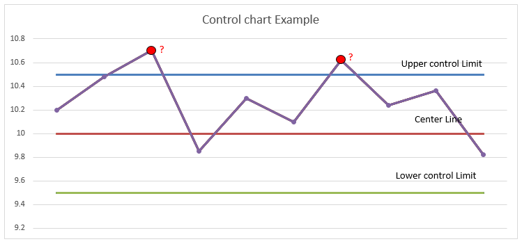
And the chart shows the two data points which are not in specification / not in control condition.
What it means? what happen in the process?
So at these two point, there is chance of common cause or special cause occurrence in the process, leads to produce the output which is not in control.
Next we will see the types of control charts and how the control limits are set.
Benefits of control chart
- Predict process out of control and out of specification limits
- Distinguish between specific, identifiable causes of variation
- Can be used for statistical process control
- Improved worker morale because of the satisfaction they get from seeing
the results of their work
Types of control chart
Next, we will touch on the types of charts,
Selection of control charts
And details of each type of chart
Let’s dive in..

The selection of the type of chart is based on the data you capture.
So we will touch on all chart selection criteria and their use.
Also, we will see the structure for the selection of control charts.
7 Types of control charts
- Xbar-R chart
- Xbar-S chart
- I-MR chart
- P chart
- np chart
- U chart
- C chart
Selection of control charts
The selection of type of chart is base on the what data you capture?
Therefore in the below chart, you will see what type of control chart is used and where it is applicable.
So in this chart you see, the chart is categorized based on data type, Subgroup size & defect/defective type.
You can learn what is subgroup? by click here.

What is Data types?
The data is the basics for the control chart.
Therefore in statistical techniques there is the analysis of samples and the data.
This data is collected by measurement of sample quantity.
So all processes are generating the data and this data is categorized as ‘Continuous data’ and Attribute Data.
1. CONTINUOUS DATA:
Also called variable data.
Continuous data is obtained by measurement using the measuring instrument. Example: Diameter of rod, Width of block, Temperature, weight, etc.

2. ATTRIBUTE DATA:
Also called discrete data.
This type of data is categorized by level or it is countable data. Example: Count of students at each division, good – bad, Ok – Not ok, etc.

1# Xbar-R chart
You will learn step by step guide of each type of control chart.
What is an Xbar-R chart?
The Xbar-R chart is the tool to monitor the process.
From this chart we can take action on any outside points (on special cause) to bring our process in control.
In the Xbar-R chart, you need to collect data by measuring samples from the process.
This data is measured at equal intervals of time.
So that you get the average of each interval and Range from measure data.
Xbar = Sample Average ( X̅ )
R = Sample Range (R)
How to collect data for the Xbar-R chart?
Collect data by measuring samples from the process.
You need to select the sample size (Subgroup), and according to that collect the data by measurement of samples at regular interval of time.
So as per the selection criteria, we are using the Xbar-R chart when the subgroup size is 8 or less.
Let’s say I am checking the diameter of the rod, as 5 samples per production shift.
You can define the time interval by your choice as per day, after every 4 hour,s etc.
This data is measured at equal intervals of time.
Therefore I have gathered the data for 10 days in the below table

How to draw an Xbar-R chart?
Now we don’t have any control limits define.
Therefore we need to draw only the average chart at the initial data collection stage.
So calculate the Average (Xbar) of the data, I have calculated the same in the below table.
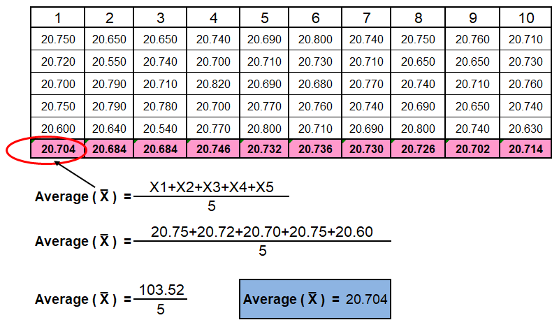
Similarly, calculate the Range (R) of the data,
The range is shown in the below table.

Now after collecting the data for define time period, the next step is to define/set the control limits for the control chart.
We will see the control limit for the Xbar-R chart.
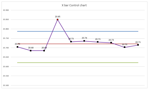
The Centerline is the Average of all Data points
Xbar chart CL = Average of all data points = 20.72
R chart CL = Average of Range (Rbar) = 0.15
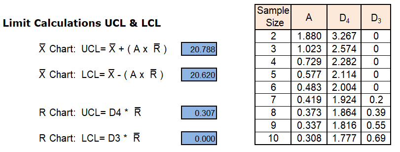
Finally after calculating the control limit,
Draw the chart as shown below.

Now its time to monitor the process,
We have set our control limits for the process.
So do the regular measurement of the parameter and put this reading in the chart so that you can monitor the behaviors of the process.
For example, here I have plotted the same reading of above into the chart and we get the output as the Xbar-R control chart.

How to read/predict a control chart?
Many of us can draw the control chart but are not able to analyze the chart.
From the chart we need to find out the special cause present in the process.
So that we can take action on that causes and bring our process within control limit.
Common cause criteria:
The variation present in the process is due to common causes.
Therefore you observe that each data point fluctuates with a small amount of variation, for this, we can say common cause variation in the chart.
Special cause criteria:
In the AIAG manual for Statistical process control (SPC), we found the criteria for identifying the special cause present in the process.
- If you found one point above the upper or below the lower control limit, it means of special cause occurred at this time in the process.
- 7 points were found consistently above or below the center line then also there is a special cause phenomenon present in the process.
- Similarly, continuous 6 points in increasing or decreasing order can say special cause present.
- 14 points in a row alternatively up & down condition.
- 2 out of 3 points > 2 standard deviations from the center line (same side).
- 4 out of 5 points > 1 standard deviation from center line (same side).
- 15 points in a row within 1 standard deviation from the center line (either side).
- 8 points in a row > 1 standard deviation from the center line (either side).
2# Xbar-S chart
For the Xbar-S chart, a similar process is to be followed as on the Xbar-R chart,
The only difference is instead of calculating the Range in R-chart,
Here Standard deviation (S) is calculated for the S chart and plotted the same in the graph.
So that you get the average of each interval and standard deviation from measure data.
Xbar = Sample Average ( X̅ )
S = Standard deviation (S) – You can calculate standard deviation in excel by formulae [=STDEV(number 1, number 2…number n)]
below are the formulae for Standard deviation (S)

Now after collecting the data for the defined time period, the next step is to define/set the control limits for the control chart.
We will see the control limit for the Xbar-S chart.
The Centerline is the Average of all Data points
Xbar chart CL = Average of all data points
S chart CL = Average of Standard deviations

3# I-MR chart
What is an I-MR chart?
I = Individual chart
MR= Moving range chart
I-Chart: Individual chart use for monitoring the individual points measure in the process. In this chart we can monitor the mean of our process at each interval of the reading measure. we can identify common & special causes from this chart and monitor the same.
MR Chart : In the moving range chart we are measure the difference between each individual measurement and plot it on the chart. Therefore this will help us to identify the process variation present in the system.
how to collect data for the I-MR chart?
The data is collected at regular intervals of time,
As there is no subgroup-wise data is required for the I-MR chart,
Now after collecting the data for the defined time period, the next step is to define/set the control limits for the control chart.
Below are the data measure for the diameter of the rod,

how to draw an I-MR chart?
Now from the data calculate the moving range,
So moving range is the difference between current data and last-measure data.
In the table, we have calculated the moving range.


Now calculate the control limit for individual and moving range chart from the data we have,
Formulae of control limits for I-MR chart,
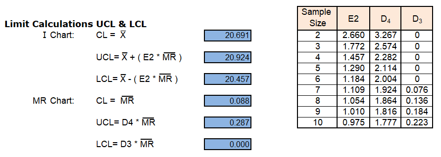
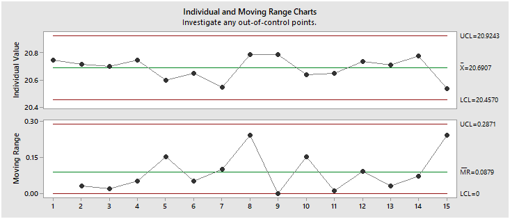
You can draw the chart in excel as the same method for drawing the Xbar-R chart.
Attribute data type control charts
As we saw in the above paragraph what is the attribute / Deseret data type?
And these charts are categorized by defect / defective and sample size fix/variable.
Now we just touch on the term what is defective and defects?
WHAT IS DEFECTIVE?
When we inspect the sample of 20 parts and found that 5 parts as NOK, then we have 5 defective parts out of 20.
WHAT IS A DEFECT?
Now let’s go through the example, we have 10 mobile phones for inspection.
It is found that the phones have non-conformity such as scratches, cracks, and dents, therefore after an inspection found that 10 scratches, 2 cracks, and 8 dents among the 10 phones.
Let’s conclude that the defects are the non-conformity observed in the part due to the same part getting defective.
Finally, the defective part may have many defects.
Now in this attribute data type, there are 4 types of control charts.
p-chart: For defective and subgroups data or the sample size is the same or may vary.
np-chart: For defective and Sample size is fixed.
u-chart: Use for defect and subgroup or the sample size is same or may vary.
c-chart: use for defect and Sample size is fixed.
4# P Chart
What is a P chart?
P chart is an attribute data type control chart.
Therefore the data should be in attribute form, we saw above that what is attribute data.
P-chart is the percentage of defective units non-confirming / Defective.
In this chart subgroup size may vary.
how to collect data for the P chart?
The attribute data is collected at regular intervals of time,
It may or may not require subgroup-wise data for the p-chart.
Now the data has been collected such as I have measured the 200 parts and found 20 defective,
So we have 20 defectives from a sample size of 200, in the next sample size of 220 parts found 10 defective.
therefore the sample size may vary in p-chart.

how to draw a P chart?
Now from the data, we will calculate the control limit first,
The sample size is not constant, therefore the control limits for each point vary in the chart plotted,
In the table, we have calculated the moving range.
Now calculate the control limit for the p chart from the data we have,
Formulae of control limits for p chart as below,

Now draw the chart using the control limits and the data points in that,
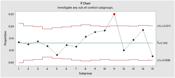
You can draw the chart in excel, if you have a constant sample size then the control limit lines should be straight lines.
You can use a p chart for both variable sample size or fix sample size.
5# np Chart
What is the np chart?
np chart is an attribute data type control chart.
np-chart is the percentage of defective unit non-confirming / Defective with a fixed sample size.
In this chart, the subgroup size is fixed.
how to collect data for np chart?
The attribute data is collected at regular intervals of time,
It requires collecting data subgroup-wise with fixed sample size.
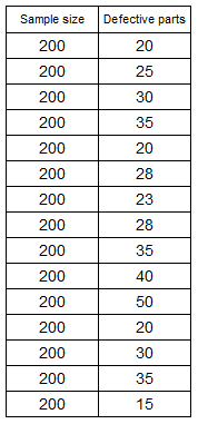
Now the data is collected such as, I have measured the 200 parts at defined time intervals and recorded data for how many defective parts were found in the sampling frequency of 200 parts.
So we have below data for defective from a sample size of 200 per shift,
how to draw an np chart?
Now calculate the control limit for the np chart from the data we have,
Formulae of control limits for np chart as below,
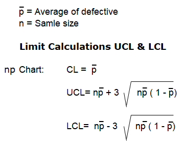
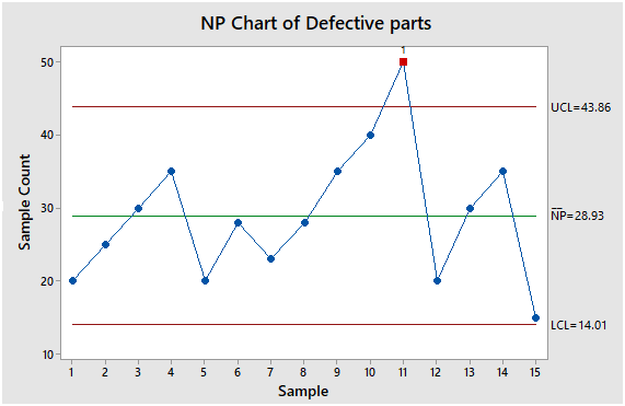
From the data calculate the above terms in formulae and draw the chart,
Following are the chart drawn in Minitab, you can draw in excel as we draw for the Xbar-R chart.
6# u chart
What is u chart?
u chart is an attribute data type control chart.
Therefore the data should be in attribute form, we saw above that what is attribute data?
u-chart is the percentage of defect of unit non-confirming.
In this chart subgroup size may or may not vary.
how to collect data for u chart?
The attribute data is collected at regular intervals of time,
It may or may not require subgroup wise data for the u-chart.
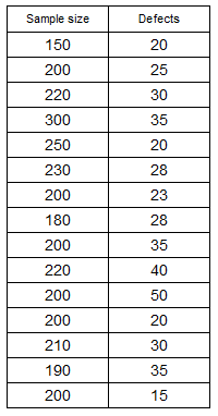
Now the data is collected such as, I have measured the 200 parts and found 20 defects,
So we have 20 defects from a sample size of 200, in the next sample size of 220 parts found 10 defects.
therefore the sample size may vary in u-chart.
how to draw u chart?
Now from the data, we will calculate the control limit first,
The sample size is not constant, therefore the control limits for each point vary in the chart plotted,
Now calculate the control limit for u chart from the data we have,
Formulae of control limits for u chart as below,
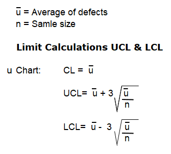
Now draw the chart using calculating the control limits and analysing the data in the chart,

You can draw the chart in excel, if you have a constant sample size then the control limit lines will be straight lines.
You can use a u chart for both variable sample sizes or fix sample sizes.
7# c chart
What is a c chart?
c chart is an attribute data type control chart.
In this chart subgroup size is fixed.
how to collect data for the c chart?
The attribute data is collected at regular intervals of time,
It requires collecting data subgroup-wise with fixed sample size.
Now the data is collected such as, I have inspected the 200 parts at defined time intervals and recorded data for how many defects were found in the sampling frequency of 200 parts.
So we have below data for defects from a sample size of 200 per shift,

how to draw a c chart?
Now calculate the control limit for the c chart from the data we have,
Formulae of control limits for c chart as below,
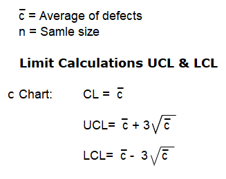
From the data calculate the above terms in formulae and draw the chart,
Following are the chart draw in Minitab, you can draw in excel as we draw for the Xbar-R chart.

Here we complete the control charts and types of control chart topics, which is important tool for monitoring the parameters in manufacturing.
One of the tools among 7 QC tools.

I am a full time Engineer and Quality Professional with over 11+ years of experience in the automotive industry. My professional journey has started from a small enterprise quality inspector to a advanced quality expert. I am creating a good-quality content for engineers. Help them to grow in their career.Learn more here.

