
- What is a Control Chart?
- Concept Explanation - How a Control Chart Works
- Step-by-Step: How to Create a Control Chart
- How to Read/Predict Control Chart
- Real-World Example of Each Control Chart Type
- Advantages of Control Charts
- Limitations of Control Charts
- Best Practices for Using Control Charts
- Common Mistakes and How to Avoid Them
- Checklist or Template (Example Table)
- Summary / Key Takeaways
- Frequently Ask Questions (FAQ)
What is a Control Chart? #
In manufacturing quality control, the Control Chart is one of the most powerful and visual tools used to monitor process variation over time.
It helps quality engineers to find difference between normal (common cause) variation and abnormal (special cause) variation, which is important for ensuring a stable and capable process.
Control chart originally developed by Dr. Walter A. Shewhart at Bell Laboratories, it is also known as the Shewhart Chart or Process Behavior Chart.
In automotive manufacturing industries, control charts are widely used during SPC (Statistical Process Control) to maintain consistent quality during mass production.
In short:
A control chart tells you whether your process is under control or if it needs corrective action.
Concept Explanation – How a Control Chart Works #
A Control Chart is a graphical display of data points plotted over time, shows us that how a process behaves.
It contains:
- Central Line (CL): Represents the process average (mean value).
- Upper Control Limit (UCL): The upper boundary (typically +3 standard deviation from mean).
- Lower Control Limit (LCL): The lower boundary (typically -3 standard deviation from mean).
If all points lie within the control limits and show random variation, the process is considered statistically controlled.
If a point falls outside the limits or follows a specific pattern, it indicates a special cause variation that need to be investigated.
Types of Control Charts
Control charts are selected based on data type (variable or attribute):
What is Data types?
The data is the basis for the control chart.
Therefore in statistical techniques there is the analysis of samples and the data. This data is collected by measurement of sample quantity.
So all processes are generating the data and this data is categorized as ‘Continuous data’ and Attribute Data.
1. CONTINUOUS DATA:
Also called variable data.
Continuous data is obtained by measurement using the measuring instrument. Example: Diameter of rod, Width of block, Temperature, weight, etc.

2. ATTRIBUTE DATA:
Also called discrete data.
This type of data is categorized by level or it is countable data. Example: Count of students at each division, good – bad, Ok – Not ok, etc.

1# Xbar-R chart
You will learn step by step guide of each type of control chart.
| Type | Chart Name | Used For |
|---|---|---|
| Variable data | X̄ – R Chart | – Monitoring variable data (e.g., dimensions, thickness, torque). – Sample size is small (n = 5). – Real-time process control is needed. |
| X̄ – S Chart | – For variable data with subgroup size ≥ 10. – To detect shifts in both mean and within-subgroup variation. – More statistically reliable than R charts for larger subgroup sizes. | |
| Individual (I-MR) Chart | – For individual measurements with no subgroups. – Ideal for paint, torque, thickness, temperature, or similar continuous monitoring. – Helps detect special causes quickly in real-time processes. | |
| Attribute data | p Chart | – Attribute data (e.g., defectives per lot). – Varying sample sizes. – Monitoring proportion of defective units in production. |
| np Chart | – Attribute data. – Fixed sample size per subgroup. – To monitor defective unit counts rather than percentages. | |
| c Chart | – Attribute data (defects per unit). – Constant sample size. – Ideal for cosmetic inspections, weld defects, surface finishing, etc. | |
| u Chart | – Attribute data (defects per unit). – Varying sample sizes. – Ideal for soldering, painting, surface defects, or assembly operations with fluctuating lot sizes. |

Step-by-Step: How to Create a Control Chart #
Follow these steps to create and interpret a Control Chart easily:
Step 1: Define the Process and Data
Identify the process to monitor (e.g., diameter of a welded joint, torque of a bolt). Collect data over time at regular intervals.
Step 2: Select the Right Control Chart
Decide between variable or attribute charts based on data type.
Step 3: Collect and Subgroup Data
Gather data in rational subgroups (for example, 5 samples per hour).
Step 4: Calculate Central Line and Control Limits
Use statistical formulas to calculate:

(The values of constants A2, A3 are taken from a standard table. ANd these values depends on sample /subgroup size)
Step 5: Plot the Data Points
Plot the data in sequence against time. Draw CL, UCL, and LCL lines.
Step 6: Analyze the Chart
Look for:
- Points outside control limits
- Trends, cycles, or systematic patterns
- Runs above or below the mean
Step 7: Take Corrective Action
If any special cause variation is detected, investigate the root cause using tools like the Fishbone Diagram or 5 Whys Analysis.
How to Read/Predict Control Chart #
Many of us can draw the control chart but are not able to analyze the chart. From the chart we need to find out the special cause present in the process. So that we can take action on that causes and bring our process within control limit.
Common cause criteria:
The variation present in the process is due to common causes.
Therefore you observe that each data point fluctuates with a small amount of variation, for this, we can say common cause variation in the chart.
Special cause criteria:
In the AIAG manual for Statistical process control (SPC), we found the criteria for identifying the special cause present in the process.
- If you found one point above the upper or below the lower control limit, it means of special cause occurred at this time in the process.
- 7 points were found consistently above or below the center line then also there is a special cause phenomenon present in the process.
- Similarly, continuous 6 points in increasing or decreasing order can say special cause present.
- 14 points in a row alternatively up & down condition.
- 2 out of 3 points > 2 standard deviations from the center line (same side).
- 4 out of 5 points > 1 standard deviation from center line (same side).
- 15 points in a row within 1 standard deviation from the center line (either side).
- 8 points in a row > 1 standard deviation from the center line (either side).
Real-World Example of Each Control Chart Type #
1. X̄ – R Chart (Mean and Range Chart)
Used for: Variable data (subgroups, e.g., 5 samples per hour)
Scenario: Monitoring weld nugget diameter in an automotive door welding process.
Data Collection: Every hour, the operator measures 5 weld spots and records their diameters. (10 subgroups)


Observation:
X̄ Chart (Mean Chart)
- Center Line (CL) represents the overall process mean.
- UCL / LCL (Upper & Lower Control Limits) define the acceptable variation.
- There is a special cause,, where hour 5 shows a high average and an increased range.
R Chart (Range Chart)
- R chart monitors the spread within each subgroup.
- A sudden spike in range at hour 5 indicates inconsistent weld quality, likely due to equipment issues.
Interpretation:
The out-of-control point suggests special cause variation. Its more likely due to worn electrode tips or inconsistent current.
Action:
Inspect and replace electrode caps, verify current setting, and recalibrate the welding machine.
2. X̄ – S Chart (Mean and Standard Deviation Chart)
Used for: Variable data (larger subgroup sizes, e.g., 10 samples or more)
Formulae for limits calculation for Xbar – S chart,

Scenario: Monitoring crankshaft diameter in an engine machining line.
Data Collection: 10 crankshafts are measured every shift, and the average and standard deviation are calculated.


Observation:
X̄ Chart (Mean Chart)
- Center Line (CL) represents the overall mean of crankshaft diameters.
- All subgroup means are within UCL and LCL, indicating no special cause affecting the mean directly.
S Chart (Standard Deviation Chart)
- S chart tracks variation within subgroups more effectively than the R chart for larger sample sizes.
- A gradual upward trend in standard deviation indicates increasing process variation over time.
Interpretation:
The process mean remains stable, but variation is increasing. This often signals tool wear, temperature changes, or coolant instability.r or temperature fluctuation.
Action:
Plan preventive maintenance for cutting tools and verify coolant temperature stability.
3. Individual – Moving Range (I-MR) Chart
Used for: Single measurements (no subgroups)
Scenario: Monitoring paint thickness on vehicle doors in a paint shop.
Data Collection: One measurement per door panel (no subgroups), recorded continuously for each unit.


Observation:
I Chart (Individual Chart)
- CL is the overall average of all paint thickness measurements.
- UCL/LCL are calculated based on the moving range.
- One data point (Panel 12) is far above the UCL.
MR Chart (Moving Range Chart)
- MR Chart tracks the absolute difference between consecutive measurements.
- It helps identify sudden shifts in variation.
- In this case, the moving range spikes around the outlier panel.
Interpretation:
A single outlier is observed, so it is a special cause variation. The possibility is of paint nozzle malfunction or air pressure variation.
Action:
Inspect the spray nozzle, verify paint viscosity, and check compressed air system.
4. p Chart (Proportion Defective Chart)
Used for: Attribute data (percentage of defective items per lot; varying sample size)
Formulae of control limits for p chart as below,

Scenario: Inspecting wiring harness connectors for missing clips in each batch.
Data Collection: Each batch has a different number of connectors (sample size varies), and the proportion defective is calculated.

Observation: One batch shows 8% defective clips, exceeding the upper control limit.
Interpretation:
A single batch shows out-of-control behavior. Batch 8 clearly exceeds the UCL, indicating an unstable process, may be due to operator fatigue or connector design issue.
Action:
Investigate assembly area ergonomics, check connector mold integrity, and verify operator training.
5. np Chart (Number of Defectives Chart)
Used for: Attribute data (fixed sample size, count of defective units)
Formulae of control limits for np chart as below,
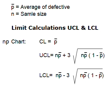
Scenario: Monitoring seat frame inspection where 50 frames are checked every shift.
Data Collection: Record number of defective frames (e.g., cracks, weld breaks) from each inspection batch.

Observation:
Batch 10 shows 9 defective frames, which is above the Upper control limit, which shows a process shift or equipment issue.
Interpretation:
High defect count indicates special cause variation. The causes are fixture misalignment, improper welding, or equipment wear.
Action:
Stop production, inspect welding fixtures, and perform alignment calibration.
6. c Chart (Count of Defects per Unit)
Used for: Attribute data (same sample size, count multiple defects per unit)
Formulae of control limits for c chart as below,
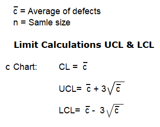
Scenario: Checking surface defects on car bumpers (scratches, dents, pinholes).
Data Collection: Each bumper is inspected, and the number of defects per bumper is recorded.

Observation:
Most bumpers have 2–3 defects, but sample 12 shows 8 defects, which is above the UCL.
Interpretation:
Sample 12 indicates a special cause of variation, indicates process contamination or handling issues.
The causes are paint booth contamination, poor handling between painting and inspection.
Action:
Clean booth filters, inspect handling process, and check operator practices.
7. u Chart (Defects per Unit with Variable Sample Size)
Used for: Attribute data (defects per unit, varying sample size)
Formulae of control limits for u chart as below,
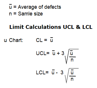
Scenario: Inspecting printed circuit boards (PCBs) in an automotive ECU line.
Data Collection: Each day, the number of PCBs inspected changes (e.g., 50 one day, 80 the next). Varying daily sample sizes (40–100 units per day). Record the number of solder defects per day.

Observation:
Day 14 shows a sharp spike in u value, even with a larger sample size.
Interpretation:
A jump in u value despite higher sample size shows process instability.
Possible due to soldering temperature drift or flux dispensing issues.
Action:
Check reflow oven temperature profile, verify flux calibration, and inspect soldering machine settings.
Advantages of Control Charts #
- Detect process variation early
- Help distinguish between common and special causes
- Support decision-making with data
- Improve process capability and consistency
- Essential tool for SPC and continuous improvement
Limitations of Control Charts #
- Require consistent sampling and accurate measurement
- Not suitable for very small or irregular data sets
- Can be misinterpreted without training
- Maintenance and analysis take time and effort
Best Practices for Using Control Charts #
- Use rational subgrouping (e.g., 4–5 samples collected closely in time)
- Regularly update and review charts
- Train operators to recognize patterns
- Combine with other QC tools (Check Sheet, Pareto Chart)
- Investigate all out-of-control signals immediately
Common Mistakes and How to Avoid Them #
| Mistake | How to Avoid |
|---|---|
| Collecting data randomly | Maintain consistent sampling intervals |
| Ignoring small trends | Analyze run rules and early warning signs |
| Using wrong chart type | Match chart to data type |
| Overreacting to common cause | Confirm special cause before taking action |
Checklist or Template (Example Table) #
| Subgroup | Sample 1 | Sample 2 | Sample 3 | Sample 4 | Sample 5 | Mean (X̄) | Range (R) |
|---|---|---|---|---|---|---|---|
| 1 | 12.5 | 12.4 | 12.6 | 12.5 | 12.7 | 12.54 | 0.3 |
| 2 | 12.5 | 12.5 | 12.4 | 12.6 | 12.6 | 12.52 | 0.2 |
| … | … | … | … | … | … | … | … |
Summary / Key Takeaways #
- A Control Chart is a time-based tool used to monitor process stability.
- It helps detect special causes before defects reach the customer.
- Always combine it with other 7 QC Tools for effective problem-solving.
- In automotive manufacturing, control charts are key to achieving zero-defect goals under IATF 16949.
Continue learning with the next QC tool: Cause and Effect Diagram – Complete Guide in Detail
Frequently Ask Questions (FAQ) #
A control chart helps identify whether a process is stable or if it needs corrective action by distinguishing between normal and abnormal variations.
Variable charts (like X̄-R) handle continuous data such as dimensions, while attribute charts (like p or c chart) handle discrete defect data.
When data points fall outside UCL or LCL, or show a trend pattern (e.g., 7 consecutive points increasing), the process is out of control.
Yes, control charts are useful anywhere process data is collected, from manufacturing to service operations like call centers or logistics.
Update it as soon as new data is available, typically at the same frequency as your sampling plan.


